JOYA
Encouraging customers to taste the joy
Joya was the original milk substitute when it launched 30 years ago, far ahead of its time. While still being well-loved across Austria, Germany and Eastern Europe, Joya’s packaging was looking dated next to the ever-growing line-up of trendy plant-based milks on shelf.
A brighter approach.
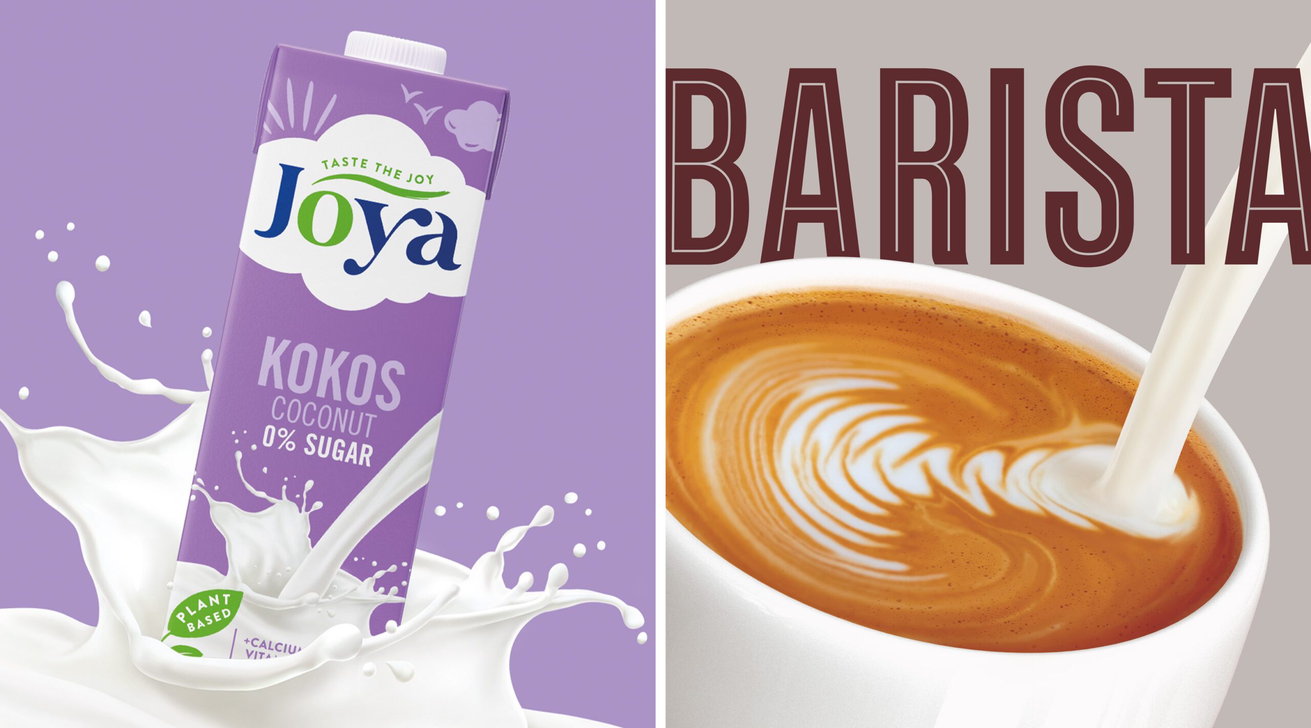
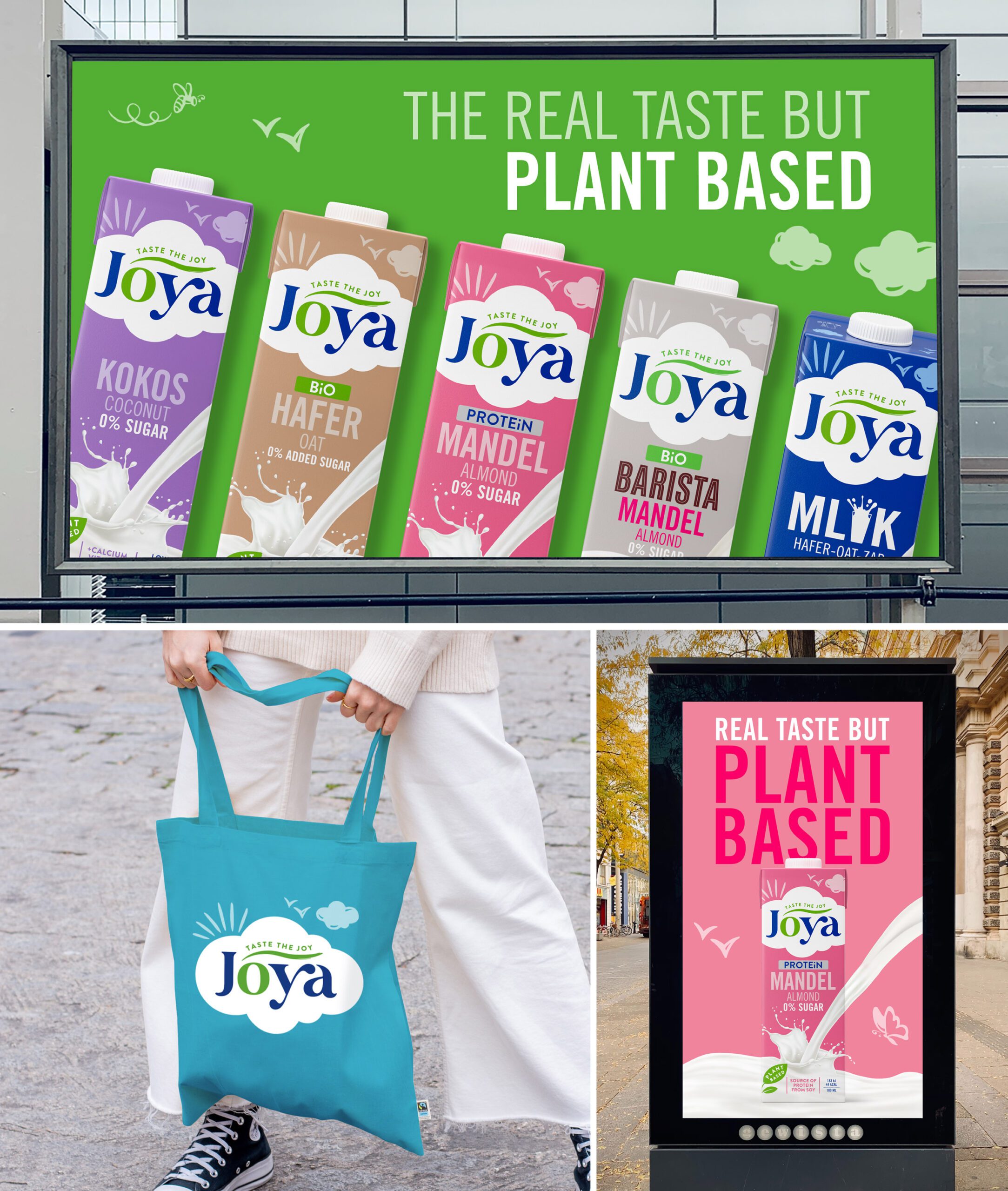
Joya’s biggest differentiator was its name, so we injected that same feeling of joy into the brand identity and packaging, starting with the addition of a tagline “taste the joy”. Keeping the essence of the brand, we evolved the overall packaging design to appear fresher, more contemporary, and premium. Starting with the finessing of the word mark itself by adding curvature to the letter forms we were able to evoke an uplifting sense of ‘Joy’. Then treatment was then given to the previously recessive cloud and bird illustrations – to draw out more of a prominent and playful visual brand world. Further enhancement was given to product descriptor fonts to make them more prominent and in keeping with the playful attitude of the brand.
Putting the joy in Joya.
We turned up the volume on the colour palette – moving away from faded pastels to brighter, more vibrant colours. Further dynamism was added into the milk splash to make it appear energised – showcasing a more positive approach to the liquid. The result is a brand that customers can connect with – simply put it exudes more joy and quality.
What we did:
Brand Identity, Packaging