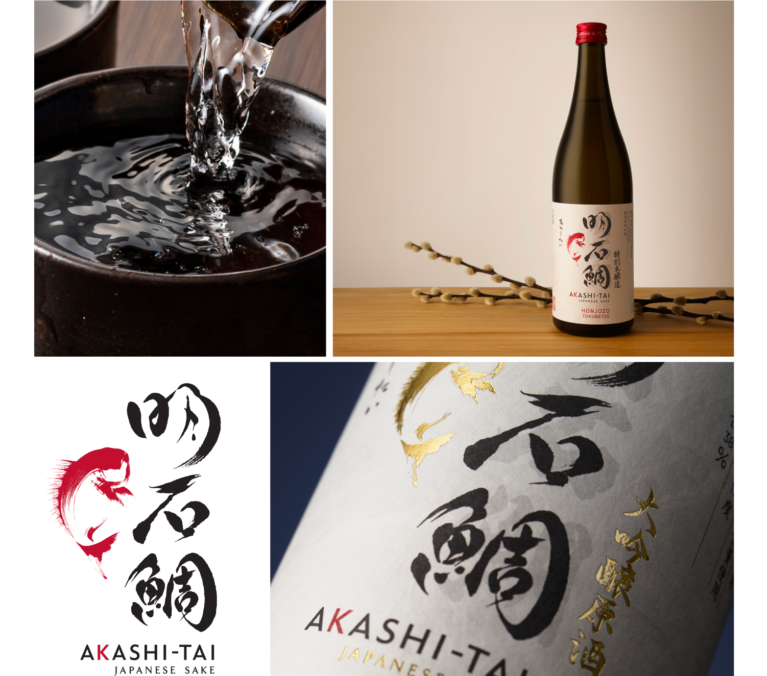
Premium Sake Packaging
Akashi-Tai

Harnessing Japanese sake trends to hook a global audience

Japanese sake has long been Japan’s national drink, with traditional brand identity and packaging design dominating the shelves. It was the toast of weddings, the ritual offering in shrines, and the comfort of izakayas. For much of history, domestic consumption dominated: sake was enjoyed almost exclusively by Japanese people at home or by diaspora communities abroad. But in recent years, the story has changed. Sake now sits at a crossroads in the global market for alcoholic beverages. Two powerful forces are reshaping the sake industry: the continued international popularity of Japanese cuisine, and a global surge of interest in authentic, craft-driven categories. According to Wine Business, sake exports rose by 6% in 2024, reaching a record 80 countries worldwide. The global sake market size was valued at approximately USD 10.5 billion in 2022 and is projected to grow at a steady growth rate of 4.5% CAGR through 2030 (Research and Markets).

This moment is not accidental. As market research and research reports show, shifting consumer preferences, the aging population in Japan, and rising consumer interest abroad have pushed sake into the spotlight.

The brand identity & packaging design challenge

Akashi Sake Brewery has brewed sake since 1856, relying on time-honoured production methods and deep respect for the brewing process. For generations, the Tai fish had been its symbol — representing strength, resilience, and curiosity in Japanese folklore. Locally, Akashi-Tai was instantly recognisable. But with intense competition in both domestic consumption and international markets, the brand faced a clear need to evolve. International consumers expected clarity around alcohol content, different styles, and flavor profiles. At the same time, the brand needed to hold on to its cultural significance at home. Our task was to build a design system that bridged East and West, simplified navigation for younger consumers, and gave Akashi-Tai the premium cues needed to compete in the world of alcoholic beverages.

Design that resonates across cultures

Armed with insight, we created a design system that distilled complexity into clarity. The Tai fish became our anchor. We commissioned French artist Aurore de la Morinerie, trained in Japan, to reimagine the fish in elegant brushstrokes. We collaborated with Japanese calligrapher Hirano Sogen to craft a bespoke wordmark that balanced tradition with modernity. The packaging itself used restrained palettes on Japanese paper, signalling authenticity. Frosted glass bottles conveyed premium quality. Neck labels distinguished premium sake varieties, while colour coding simplified range navigation — a crucial aid for international consumers unfamiliar with sake.

In doing so, the design acted as an educational initiative. Without long explanations, it helped consumers quickly identify style, alcohol content, and flavour cues. It bridged the gap between traditional sake symbolism and modern consumer demands.

A brand ready for the world stage

The redesigned Akashi-Tai positioned the brand for sustainable growth both at home and abroad. In Japan, it connected with the younger generation through clarity and design. Abroad, it drove sake imports, securing listings in major cities across the United States, the United Kingdom, and Asian markets. The brand is now used in educational initiatives, tastings, and sake courses that introduce international consumers to its different styles. By clearly communicating sake quality and guiding new audiences through the sake category, the redesign increased visibility across distribution channels and built confidence among retailers and drinkers alike.

Akashi-Tai demonstrates how sake producers can use design as a business lever. By honouring ancient times and the brewing process, while embracing modern innovations, the brand achieved steady growth in export markets. It shows how best practices in brand storytelling can help a traditional sake brewery thrive amid intense competition and rising production costs.

Conclusion

Sake is no longer confined to Japan. It is part of the global market for alcoholic beverages, with significant growth potential across international markets. For Akashi-Tai, the redesign was about more than packaging. It was about creating a brand identity that could lead with purpose, connect with a global audience, and drive sustainable growth. Akashi Sake Brewery & Kaikyō Distillery now stands as one of the most recognisable sake breweries ready to thrive both in domestic consumption and in new markets abroad.

What we did:
Illustration, Packaging Design

Explore more of our work

Let’s talk about your brand. Contact us

We go beyond the brief to solve brand and business problems with shopper insight and strategic creativity.

team

Wilfred Castillo

Associate CD

SEA

Lorem ipsum dolor sit amet, consectetuer adipiscing elit, sed diam nonummy nibh euismod tincidunt ut laoreet dolore magna aliquam erat volutpat. Ut wisi enim ad minim veniam, quis nostrud exerci tation ullamcorper suscipit lobortis nisl ut aliquip ex ea commodo consequat. Duis autem vel eum iriure dolor in hendrerit in vulputate velit esse molestie consequat, vel illum dolore eu feugiat nulla facilisis at vero eros et accumsan et iusto odio dignissim qui blandit praesent luptatum zzril delenit augue duis dolore te feugait nulla facilisi.

Lorem ipsum dolor sit amet, cons ectetuer adipiscing elit, sed diam nonummy nibh euismod tincidunt ut laoreet dolore magna aliquam erat volutpat. Ut wisi enim ad minim veniam.

Does your brand identity & packaging design connect with shoppers? Want to have a chat about it?

team

Adam Cameron

Global CFO

Text

Lorem ipsm dolor sit amet, consectetuer adipiscing elit, sed diam nonummy nibh euismod tincidunt ut laoreet dolore magna aliquam erat volutpat. Ut wisi enim ad minim veniam, quis nostrud exerci tation ullamcorper suscipit lobortis nisl ut aliquip ex ea commodo consequat. Duis autem vel eum iriure dolor in hendrerit in vulputate velit esse molestie consequat, vel illum dolore eu feugiat nulla facilisis at vero eros et accumsan et iusto odio dignissim qui blandit praesent luptatum zzril delenit augue duis dolore te feugait nulla facilisi.

Lorem ipsum dolor sit amet, cons ectetuer adipiscing elit, sed diam nonummy nibh euismod tincidunt ut laoreet dolore magna aliquam erat volutpat. Ut wisi enim ad minim veniam.

team

Sharon Lee

Managing Director

APAC

Lorem ipsum dolor sit amet, consectetuer adipiscing elit, sed diam nonummy nibh euismod tincidunt ut laoreet dolore magna aliquam erat volutpat. Ut wisi enim ad minim veniam, quis nostrud exerci tation ullamcorper suscipit lobortis nisl ut aliquip ex ea commodo consequat. Duis autem vel eum iriure dolor in hendrerit in vulputate velit esse molestie consequat, vel illum dolore eu feugiat nulla facilisis at vero eros et accumsan et iusto odio dignissim qui blandit praesent luptatum zzril delenit augue duis dolore te feugait nulla facilisi.

Lorem ipsum dolor sit amet, cons ectetuer adipiscing elit, sed diam nonummy nibh euismod tincidunt ut laoreet dolore magna aliquam erat volutpat. Ut wisi enim ad minim veniam.

Add Your Heading Text Here

Lorem ipsum dolor sit amet, consectetur adipiscing elit. Ut elit tellus, luctus nec ullamcorper mattis, pulvinar dapibus leo.