Beer Packaging Design
Coopers Brewery​

Celebrating 5 years with Coopers!

For 5 years now, we’ve had an amazing partnership with our favourite brewery – Coopers! It’s been an incredible journey, from a full portfolio and architecture redesign to exciting NPD’s, limited editions, promotions and on-going design strategy support.

Together, we’ve elevated their brand legacy and it’s been a thrill to be a part of shaping the future of this iconic brand. Cheers to the Coopers team for the trust and collaboration. It’s been an honour to be a part of the Coopers family, and we’re just getting started!
 Here’s to many more creative milestones ahead!

Re-crafting an Icon for a New Generation

Refreshing an icon is both an incredible honour and a delicate task, especially when it comes to a beloved 160-year-old Australian ale house. Coopers Brewery found itself in need of a beer packaging design refresh, marking the first time in its history that packaging was approached from a strategic brand perspective.

At a time when craft-mania was sweeping the nation, beer businesses were tugging at threads to try and build heritage stories into what were fairly young brands. Coopers, however, had no need for faux-authenticity. Its 160-year heritage ran deep – it was family-owned, masterfully brewed and crafted with a unique, vessel-fermented process.

The mission was clear: showcase the genuine heritage and rich provenance that defines Coopers, all while ensuring its relevance to a new generation.

Beer Packaging Design

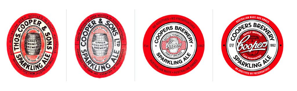
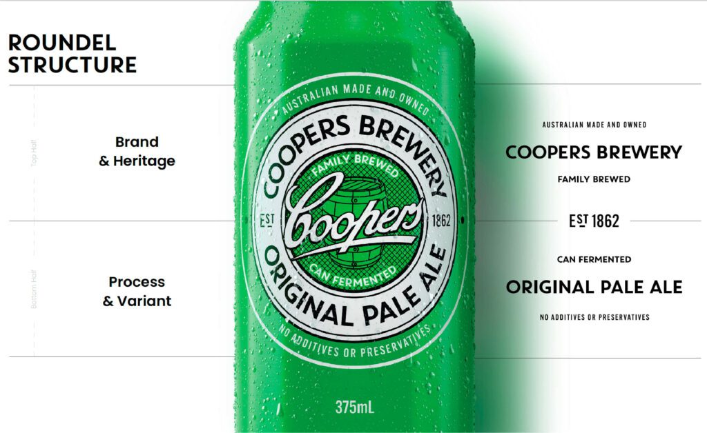
To tell the heritage story, we brought our ‘Forever Original’ positioning front and centre. The roundel, the brand’s most recognisable asset, was elevated to work even harder through a strengthened script.

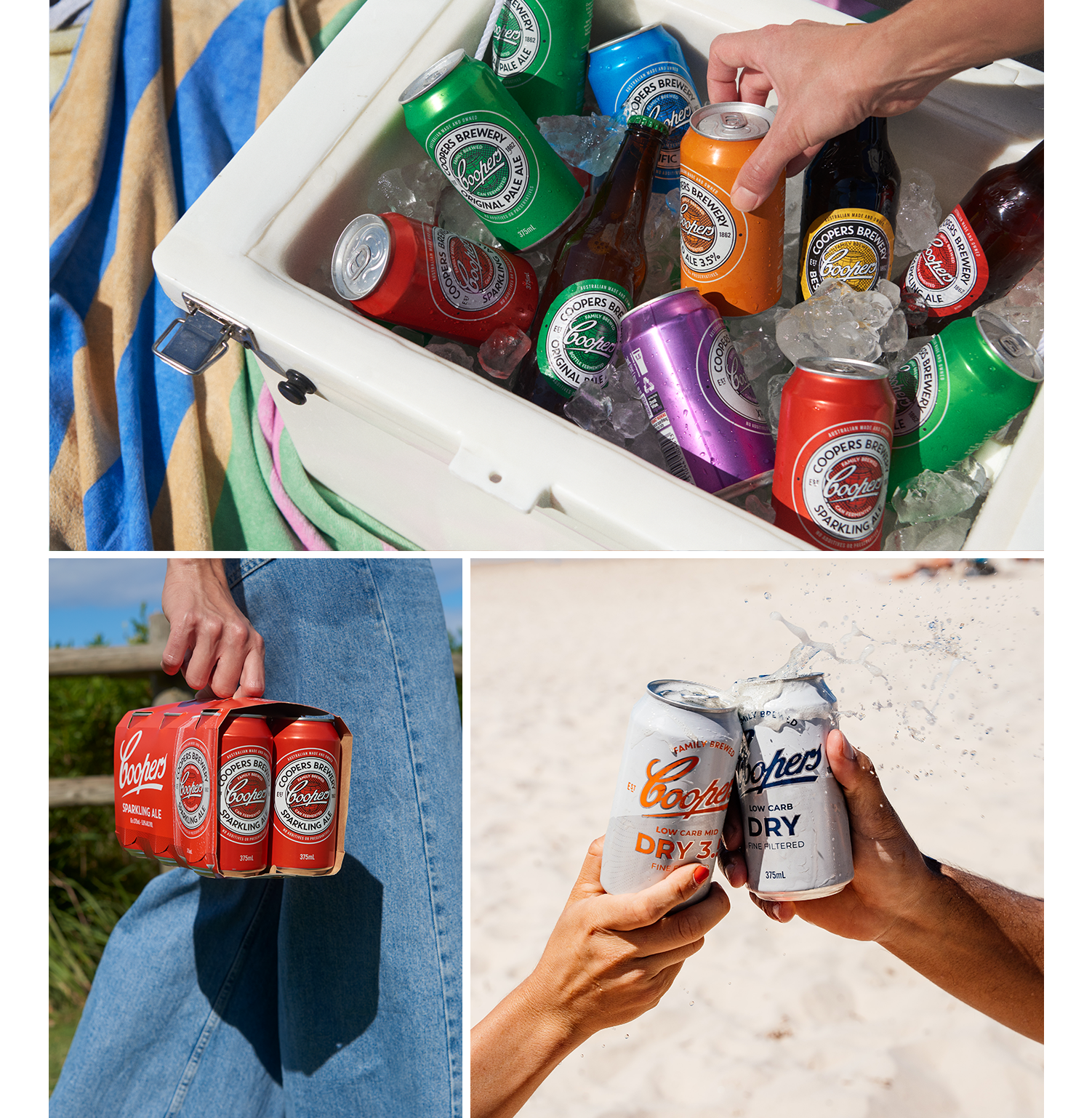
We also underscored elements that speak to tradition and process – from a barrel illustration to descriptors proudly stating that Coopers is family-brewed and uniquely can-fermented. In modernising the branding, we created a clear pack structure and hierarchy – making it easy for shoppers to navigate across single bottles, cans, clusters and cartons.

Beer Packaging Design

Brewing a Modern Day Classic

While Coopers is primarily known for their craft ales, we also developed a new look and feel for their lagers range. The simplified and focused design creates a range that feels lighter and more contemporary to appeal to a wider market of younger consumers looking for a sessionable brew without compromise.

Beer Packaging Design

A Brand in Full Bloom

Coopers regularly release seasonal ales to not only build on their extensive flavour profiles, but also drive interest and intrigue among an eager and curious market of explorers. In 2023, Cowan helped Coopers develop its limited edition Botanic Ale, using beer packaging design to give the seasonal release its own distinctive presence.

Building on the established brand assets, we gave the new seasonal ale a unique character to drive excitement and taste appeal across a wide range of touchpoints, helping solidify Coopers as not only a legacy brand, but one with a competitive contemporary edge through thoughtful beer packaging design.

The latest data shows Coopers cans are growing +13%, supported by exciting collaborations and the successful transition of consumer favourites from stubbie to can format.

Beer Packaging Design

A Winning Collaboration – the Journey Continues

We’re always thrilled to be part of the Coopers journey, and this time we’ve given low carb lager range a bold new look. A key challenge was to retain the timeless Coopers roundel from the core range yet introduce a clearly differentiating brand expression for the low carb lagers.

The result is both contemporary and iconic – a natural extension of the strong design legacy we have created with Coopers over the years.

Beer Packaging Design
In-Depth Case Study

A Heritage of Humour, Craft, and Culture

With legendary foundations back to 1862 in Adelaide, Coopers Brewery has grown into Australia’s largest independently-owned brewery – and a true national treasure in the Australian beer category. For more than 160 years, Coopers has been perfecting the art of naturally conditioned ales, all while serving up that streak of irreverent Aussie humour that makes the brand feel as authentic as a backyard barbie.

Coopers isn’t just beer – it’s part of Australia’s culture. From backyard BBQs to pubs, from footy matches to milestone celebrations, Coopers has become a trusted companion at life’s big and small moments. With a reputation built on craftsmanship, community, and independence, Coopers continues to prove that heritage isn’t about looking back—it’s about staying original while moving with the times.

The Brief: Packaging That Amplifies Legacy and Lifts Relevance

By 2021, Coopers decided it was time for a rethink – their first strategic packaging refresh in two decades. The challenge was twofold: keep loyal fans reassured while modernising the design to appeal to younger beer drinkers who see beer as an expression of lifestyle.

The brief to Cowan was clear: take an icon and make it feel fresh, modern, and confidently Australian. At the heart of this challenge sat the roundel, Coopers’ most recognisable asset. The redesign had to amplify this symbol of legacy while ensuring the pack structure and story worked harder across every format.

The key Considerations were:

Authenticity Must Shine
Coopers doesn’t need to manufacture a heritage story – it already has what other brands wish they had. Family-owned for six generations, brewed with a unique top-fermentation process, and rooted in Adelaide’s history, its provenance is second to none. The redesign needed to put this authentic craft and lineage front and centre in a way that connects with modern beer consumers.

Modern Clarity and Shelf Impact
Beer aisles are crowded, and online shopping moves fast. Coopers packs needed instant recognition with a clear structure that made it easier for drinkers to navigate the portfolio – whether buying single bottles, cans, clusters, or cartons.

Balancing Ritual and Relevance
Australians love the rituals of beer – sharing a carton with mates, clinking glasses after work, or celebrating after the game. But relevance to new generations was just as important. Coopers needed to show it could stay true to its traditions while presenting itself in a modern way to Gen Z and millennials, who are drawn to craft, authenticity, and design-led choices in the beer market.

Design Considerations: Brewing Heritage for Modern Moments

Elevating the Roundel
The roundel is Coopers’ most valuable visual asset, and it was refined and emboldened to maintain its iconic recognition in the centre of the logo. Stronger scripts, sharper detail, and clearer hierarchy turned it into a beacon of recognition across the beer portfolio.

Showcasing Process and Provenance
New design details highlight what sets Coopers apart: family brewed, naturally conditioned, and uniquely top-fermented. The illustrated barrel icon in the middle of the roundel and descriptors communicate authenticity and reassure beer drinkers that this is a heritage beer brand built on craft.

Clear Structure and Navigation
Formats were streamlined so that drinkers can easily shop the range. From Pale Ale to Sparkling Ale to Stout, each product is clearly signposted. Navigation was designed to work across bottle shops, grocery stores, and digital retail platforms.

Modern Typography and Visual Language
Typography and pack finishes were sharpened to make the packs feel premium but still approachable. The balance of heritage cues and modern clarity ensured Coopers felt both historic and current – living up to its tagline, Forever Original.

Special and Seasonal Editions
The refresh extended to seasonal releases like Vintage Ale, which was given a premium craft-inspired treatment to highlight its collectability while remaining true to the masterbrand. This reinforced Coopers’ ability to innovate within the traditions of the beer industry.

At the Forefront of Shared Moments
Beer is more than refreshment in Australia – it’s a marker of connection and culture. From cracking open a cold one at a BBQ to ordering a round at the pub, beer is about shared experiences. Coopers’ refreshed design ensures the brand feels relevant in these moments, making the pack itself part of the invitation to connect.

The Forever Original positioning captures this duality perfectly. While many beer brands chase fleeting trends, Coopers remains genuine, enduring, and proudly independent. The new packaging now mirrors that truth: timeless, but ready for the next generation of drinkers.

Cowan’s Role and Expertise

Cowan’s global alcohol expertise played a key role in the redesign. Having worked on beers like Coopers and Red Ruby, as well as international alcohol brands such as Akashi-Tai, Cowan understands how to blend authenticity with modern expectations. For Coopers, this meant creating a design system that honoured the brewery’s unique heritage while ensuring it worked hard across beer shelves, taps, and celebrations.

The Result: Packaging That Honors and Elevates

  • Stronger retail impact: Coopers now stands out more clearly in grocery stores, bottle shops, and online retail, delivering better visibility and easier navigation.
  • Reassured loyalists and recruited new audiences: Long-time drinkers felt their favourite brand had stayed true, while younger beer fans saw a heritage beer brand refreshed for them.
  • Boosted category presence: Despite wider beer market challenges, Coopers’ refreshed portfolio—including the new Australian Lager—sparked renewed interest and reinforced its position as Australia’s largest independent brewery.

Conclusion: A Brew for Today and Tomorrow

Refreshing a 160-year-old Australian beer icon is no small task. The new design honours Coopers’ legacy while making sure it looks the part for a new generation of beer drinkers. By refining the roundel, clarifying pack navigation, and spotlighting authentic craft, the redesign keeps Coopers Forever Original, rooted in heritage, but always relevant.

Coopers is more than just beer. It’s culture, craft, and community – and now, it looks ready to lead the Australian beer market for decades to come.

References:
[1] Wikipedia – Coopers Brewery
[2] Good Beer Hunting – Australia Native Beer: How Sparkling Ale Survived
[3] Food & Drink Business – Brand Refresh for Coopers
[4] The Shout – Coopers Unveils New Look Packaging
[5] Packaging News – Coopers Brewery’s Vintage Ale Gets a Redesign
[6] Packaging Gateway –Coopers Brewery Packaging Refresh

What we did:
Brand Positioning, Brand Strategy, Brand Identity, Packaging Design, Production & Final Art

Explore more of our work

Let’s talk about your brand. Contact us

We go beyond the brief to solve brand and business problems with shopper insight and strategic creativity.

team

Wilfred Castillo

Associate CD

SEA

Lorem ipsum dolor sit amet, consectetuer adipiscing elit, sed diam nonummy nibh euismod tincidunt ut laoreet dolore magna aliquam erat volutpat. Ut wisi enim ad minim veniam, quis nostrud exerci tation ullamcorper suscipit lobortis nisl ut aliquip ex ea commodo consequat. Duis autem vel eum iriure dolor in hendrerit in vulputate velit esse molestie consequat, vel illum dolore eu feugiat nulla facilisis at vero eros et accumsan et iusto odio dignissim qui blandit praesent luptatum zzril delenit augue duis dolore te feugait nulla facilisi.

Lorem ipsum dolor sit amet, cons ectetuer adipiscing elit, sed diam nonummy nibh euismod tincidunt ut laoreet dolore magna aliquam erat volutpat. Ut wisi enim ad minim veniam.

Does your brand identity & packaging design connect with shoppers? Want to have a chat about it?

team

Adam Cameron

Global CFO

Text

Lorem ipsm dolor sit amet, consectetuer adipiscing elit, sed diam nonummy nibh euismod tincidunt ut laoreet dolore magna aliquam erat volutpat. Ut wisi enim ad minim veniam, quis nostrud exerci tation ullamcorper suscipit lobortis nisl ut aliquip ex ea commodo consequat. Duis autem vel eum iriure dolor in hendrerit in vulputate velit esse molestie consequat, vel illum dolore eu feugiat nulla facilisis at vero eros et accumsan et iusto odio dignissim qui blandit praesent luptatum zzril delenit augue duis dolore te feugait nulla facilisi.

Lorem ipsum dolor sit amet, cons ectetuer adipiscing elit, sed diam nonummy nibh euismod tincidunt ut laoreet dolore magna aliquam erat volutpat. Ut wisi enim ad minim veniam.

team

Sharon Lee

Managing Director

APAC

Lorem ipsum dolor sit amet, consectetuer adipiscing elit, sed diam nonummy nibh euismod tincidunt ut laoreet dolore magna aliquam erat volutpat. Ut wisi enim ad minim veniam, quis nostrud exerci tation ullamcorper suscipit lobortis nisl ut aliquip ex ea commodo consequat. Duis autem vel eum iriure dolor in hendrerit in vulputate velit esse molestie consequat, vel illum dolore eu feugiat nulla facilisis at vero eros et accumsan et iusto odio dignissim qui blandit praesent luptatum zzril delenit augue duis dolore te feugait nulla facilisi.

Lorem ipsum dolor sit amet, cons ectetuer adipiscing elit, sed diam nonummy nibh euismod tincidunt ut laoreet dolore magna aliquam erat volutpat. Ut wisi enim ad minim veniam.

Add Your Heading Text Here

Lorem ipsum dolor sit amet, consectetur adipiscing elit. Ut elit tellus, luctus nec ullamcorper mattis, pulvinar dapibus leo.