Coke Zero Packaging
Coke Zero Packaging
Coke Zero

A simple yet transformative change

Despite acing blind taste tests, Coke Zero faced a sales struggle during its US debut. Within two years, it would launch in Australia and needed a campaign for the rollout. Women were seen to be the core customers for no-cal drinks, but in actual fact – men made up about 55% of the Coke Zero market. The stronger, Coke-like flavour of Zero simply appealed to them more. The problem we recognised was that Zero’s white packaging too closely resembled Diet Coke, which was specifically tailored to attract female consumers.

While our brief was to simply roll out the current white design for Coke Zero’s launch in Australia, we saw bigger potential. The current colorway didn’t fit the brand promise of uncompromised flavour for the males, nor was it easy to distinguish from Diet Coke.

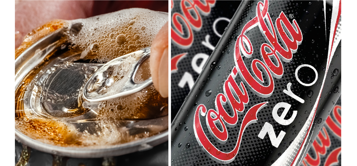
We proposed a simple, yet bold, change: make the packaging black to reflect Zero’s stronger flavour, appeal to a male audience more strongly, and differentiate the drink from Diet Coke.

Within weeks, Coke Zero became the most successful FMCG launch in Australian history. This led to the global rollout of our black packaging. In the UK alone, Coke Zero experienced a sales increase of £24 million in its first three months, and it was a hit in every market it launched in.

Today, black Coke Zero even outsells classic ‘red’ Coke in many places.

In-Depth Case Study

Coca-Cola: A Global Giant in Branding

Few companies embody global branding and consumer relevance like Coca-Cola. From its iconic red can to its timeless contour bottle, Coca-Cola is studied in design schools and retail magazines as a benchmark for excellence. Even the world’s most recognisable brand, however, must continually innovate.

Innovation is part of Coca-Cola’s DNA. As Retail World and Inside FMCG note, packaging design and brand identity are critical drivers of market share. In Australia, Coca-Cola often uses the market as a testbed for innovation, trialling new product development before rolling out globally. Our Coke Zero packaging design refreshed the iconic look, combining bold visuals and modern cues while respecting the brand’s heritage and shelf impact.

That was exactly the case with Coca-Cola Zero.

The Brief: Coke Zero’s Struggle

Coca-Cola Zero debuted in the United States with significant investment, extensive advertising, and high expectations. Consumer testing and growth modelling had indicated strong potential, particularly given its closer flavour profile to Classic Coke.

But the reality didn’t match the projections. Sales lagged, and the product struggled to carve out a distinct identity. Coke Zero’s white packaging, too closely aligned with Diet Coke, blurred its positioning and confused consumers. While women were historically considered the core market for no-calorie drinks, men actually made up about 55% of diet cola consumption and were the intended primary consumers of Coke Zero. The launch packaging failed to reflect this truth and mission.

As a result, Coca-Cola did what a strategic leader should: they paused global expansion and reassessed. The decision was made to test a new approach in Australia.

Coca-Cola chose Cowan for this challenge because of our unique positioning: with offices in Australia and key international markets, we had the local insight, global perspective, and demonstrated success in applying brand identity to best-in-class positioning, translated into packaging design. More importantly, our collaborative approach with clients was proven to deliver designs that drive strong consumer trial and deliver commercial impact.

Our Approach: Zero Degrees of Separation

We recognised that Coke Zero’s problem wasn’t flavour — blind taste tests proved it had broad appeal. The issue was brand identity alignment with its target market.

Coca-Cola’s red meant timeless taste. Diet Coke’s silver and white meant lightness and a female audience. Coke Zero needed a bold visual cue of its own.

Our solution was simple yet transformative: make it black.

Black packaging signalled strength, boldness, and modernity. It appealed directly to the male audience that Coke Zero was targeting, while creating a sharp visual contrast with Diet Coke on the shelf. It aligned the product with its promise of uncompromised flavour, while maintaining Coca-Cola’s iconic logo and global recognisability.

Taking the Risk: Reservations About Black Packaging

There were reservations. Industry commentary has often noted that black packaging can be recessive on shelf, absorbing light rather than reflecting it, and therefore lacking visibility compared to brighter colours. Packaging World has discussed the “problems with black packaging,” particularly in FMCG categories where shelf standout is crucial.

But in Coke Zero’s case, the potential benefits outweighed the risks. Black packaging not only created instant differentiation from Diet Coke and other Coca-Cola flavours, it also tapped directly into the tastes of male consumers, the group driving over half of the product’s consumption. By turning perceived risk into strategic advantage, we ensured that Coke Zero could carve its own distinctive space within Coca-Cola’s portfolio.

The Result: The Most Successful FMCG Launch in Australia

The response was immediate. Within weeks, Coke Zero became the most successful FMCG launch in Australian history, quickly surpassing expectations in supermarkets, convenience stores, and on-premise channels. Retail World covered the launch as a defining example of how packaging design drives trial and category performance.

The black pack’s success in Australia provided the evidence Coca-Cola needed to scale globally. Within three months of launch in the UK, Coke Zero sales rose by £24 million. Across Europe, Asia, and North America, black Coke Zero carved out a new audience, appealing especially to younger men who had previously abandoned the category.

Today, black Coke Zero outsells even Classic Red Coke in several markets, proving how a global branding strategy can pivot on local insights.

Designing for Global Growth

Coca-Cola Zero Black demonstrates how brand identity and packaging design can make or break a launch. Good product performance, even from a strong brand, doesn’t guarantee consumer trial on its own. By recognising the gap between perception and target market, and by using Australia as a strategic test bed, we helped Coca-Cola transform a struggling debut into a global success story.

The black packaging didn’t just redefine Coke Zero; it redefined how Coca-Cola innovates. And for a global giant, it proved that sometimes the boldest solutions are the simplest.

What we did:
Strategy, Packaging Design

Explore more of our work

Let’s talk about your brand. Contact us

We go beyond the brief to solve brand and business problems with shopper insight and strategic creativity.

team

Wilfred Castillo

Associate CD

SEA

Lorem ipsum dolor sit amet, consectetuer adipiscing elit, sed diam nonummy nibh euismod tincidunt ut laoreet dolore magna aliquam erat volutpat. Ut wisi enim ad minim veniam, quis nostrud exerci tation ullamcorper suscipit lobortis nisl ut aliquip ex ea commodo consequat. Duis autem vel eum iriure dolor in hendrerit in vulputate velit esse molestie consequat, vel illum dolore eu feugiat nulla facilisis at vero eros et accumsan et iusto odio dignissim qui blandit praesent luptatum zzril delenit augue duis dolore te feugait nulla facilisi.

Lorem ipsum dolor sit amet, cons ectetuer adipiscing elit, sed diam nonummy nibh euismod tincidunt ut laoreet dolore magna aliquam erat volutpat. Ut wisi enim ad minim veniam.

Does your brand identity & packaging design connect with shoppers? Want to have a chat about it?

team

Adam Cameron

Global CFO

Text

Lorem ipsm dolor sit amet, consectetuer adipiscing elit, sed diam nonummy nibh euismod tincidunt ut laoreet dolore magna aliquam erat volutpat. Ut wisi enim ad minim veniam, quis nostrud exerci tation ullamcorper suscipit lobortis nisl ut aliquip ex ea commodo consequat. Duis autem vel eum iriure dolor in hendrerit in vulputate velit esse molestie consequat, vel illum dolore eu feugiat nulla facilisis at vero eros et accumsan et iusto odio dignissim qui blandit praesent luptatum zzril delenit augue duis dolore te feugait nulla facilisi.

Lorem ipsum dolor sit amet, cons ectetuer adipiscing elit, sed diam nonummy nibh euismod tincidunt ut laoreet dolore magna aliquam erat volutpat. Ut wisi enim ad minim veniam.

team

Sharon Lee

Managing Director

APAC

Lorem ipsum dolor sit amet, consectetuer adipiscing elit, sed diam nonummy nibh euismod tincidunt ut laoreet dolore magna aliquam erat volutpat. Ut wisi enim ad minim veniam, quis nostrud exerci tation ullamcorper suscipit lobortis nisl ut aliquip ex ea commodo consequat. Duis autem vel eum iriure dolor in hendrerit in vulputate velit esse molestie consequat, vel illum dolore eu feugiat nulla facilisis at vero eros et accumsan et iusto odio dignissim qui blandit praesent luptatum zzril delenit augue duis dolore te feugait nulla facilisi.

Lorem ipsum dolor sit amet, cons ectetuer adipiscing elit, sed diam nonummy nibh euismod tincidunt ut laoreet dolore magna aliquam erat volutpat. Ut wisi enim ad minim veniam.

Add Your Heading Text Here

Lorem ipsum dolor sit amet, consectetur adipiscing elit. Ut elit tellus, luctus nec ullamcorper mattis, pulvinar dapibus leo.