Consumers were becoming increasingly conscious of wellness, but that didn’t stop them from wanting to experiment with new flavours. That’s where Van Sha’s founder, Sharan Bal, identified a gap. For non-drinkers like herself, genuine choice didn’t exist, all that was on offer were me-too gins and sugary cocktails that tasted and looked the same.
Mystery, spice and everything nice.
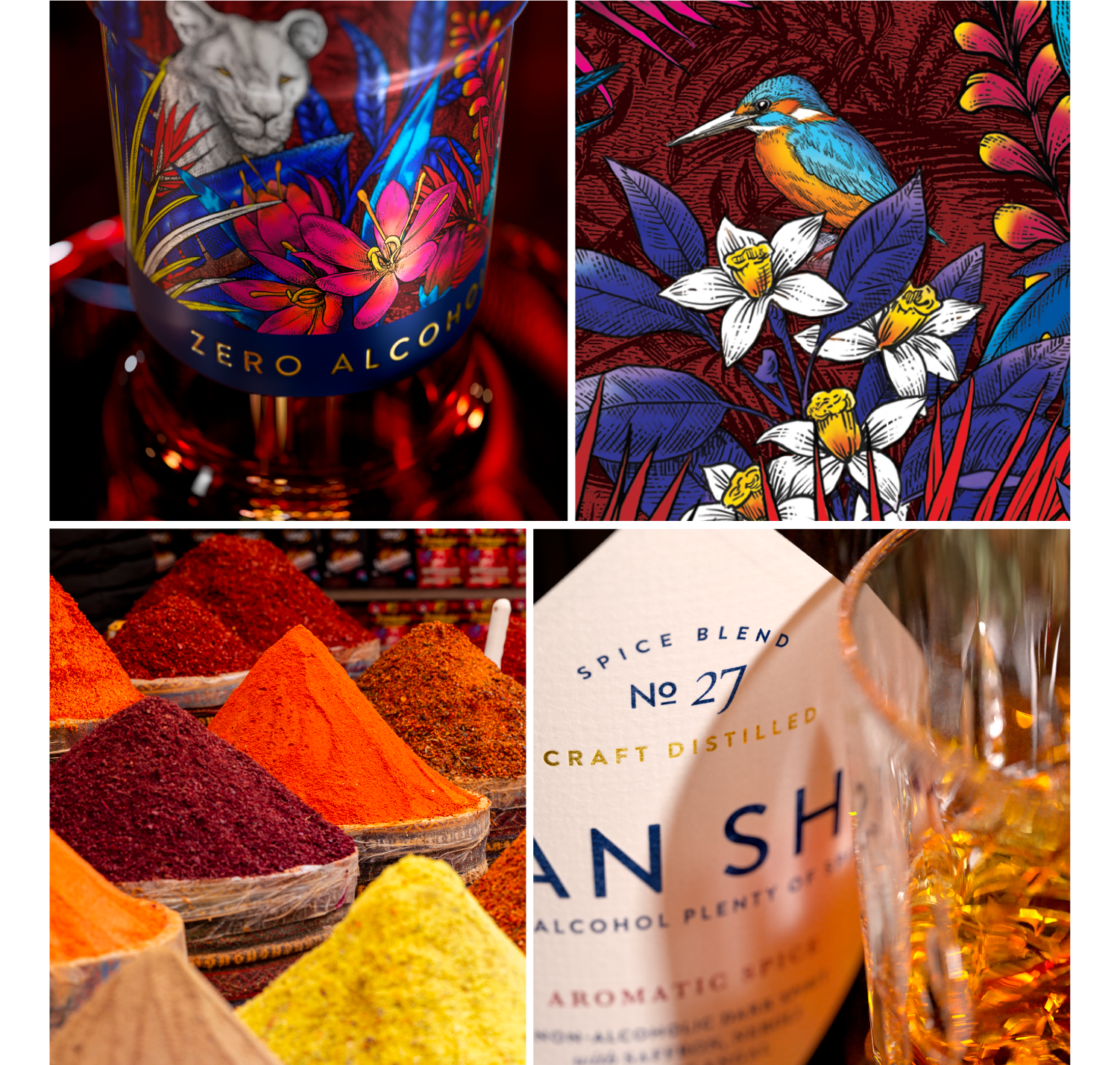
Together with Sharan, we changed the perception of bland, unadventurous non-alcoholic spirits. Sharan developed a stronger, spicier flavour drink with a rich mouth feel – and we gave it a brand identity that looked as rich, original and evocative as the drink itself. Our design system harnesses the mythical beauty of Van Sha’s origins – an Indian grove alive with colour, spice and curiosity, owned by Sharan’s family. It’s a look and feel that instantly transports you somewhere more mysterious – capturing the spirit’s bold essence.
Unlocking an uncompromising dedication to craft
Sharan’s tenacity and pursuit to create the ultimate non-alcoholic spirit saw her create 27 versions of Van Sha. That’s a level of craft we mirrored on the packaging through beautiful typography and exquisite detailing and to evoke the credibility of a layered drinking experience. We used a thick, textured paper, gold foil and embossing to convey quality – and created a rich, mystifying world through illustrations crafted with a detailed pencil, layered with vibrant jewel tones. The striking aura of India is captured through a deep red bottle – a colour that is both disruptive at the shelf, and protective of the liquid inside it.
The diamond-shaped label represents a balance between the two worlds of Van Sha – India, which inspired it, and The Netherlands, where it was created. We developed a flexible, cohesive suite of assets, guidelines and a social media strategy for the team to follow, ensuring a consistent, engaging and on-brand social feed.
The result is a spirit that commands attention on the entire shelf – not just the zero – alcohol section.
“Cowan really appreciated what I was trying to achieve. The provenance driven brand world and positioning evolved organically through our working partnership. Whilst I wanted to tell my story as a non-drinker founder looking for a solution for my own concerns – it was Cowan that helped to bring to bear the heritage aspect of my journey, capturing the vibrance of India in contemporary way”
Sharan Bal VAN SHA FOUNDER
What we did: Brand design creation, Brand Identity, Packaging
Lorem ipsum dolor sit amet, consectetuer adipiscing elit, sed diam nonummy nibh euismod tincidunt ut laoreet dolore magna aliquam erat volutpat. Ut wisi enim ad minim veniam, quis nostrud exerci tation ullamcorper suscipit lobortis nisl ut aliquip ex ea commodo consequat. Duis autem vel eum iriure dolor in hendrerit in vulputate velit esse molestie consequat, vel illum dolore eu feugiat nulla facilisis at vero eros et accumsan et iusto odio dignissim qui blandit praesent luptatum zzril delenit augue duis dolore te feugait nulla facilisi.
Lorem ipsum dolor sit amet, cons ectetuer adipiscing elit, sed diam nonummy nibh euismod tincidunt ut laoreet dolore magna aliquam erat volutpat. Ut wisi enim ad minim veniam.
Lorem ipsm dolor sit amet, consectetuer adipiscing elit, sed diam nonummy nibh euismod tincidunt ut laoreet dolore magna aliquam erat volutpat. Ut wisi enim ad minim veniam, quis nostrud exerci tation ullamcorper suscipit lobortis nisl ut aliquip ex ea commodo consequat. Duis autem vel eum iriure dolor in hendrerit in vulputate velit esse molestie consequat, vel illum dolore eu feugiat nulla facilisis at vero eros et accumsan et iusto odio dignissim qui blandit praesent luptatum zzril delenit augue duis dolore te feugait nulla facilisi.
Lorem ipsum dolor sit amet, cons ectetuer adipiscing elit, sed diam nonummy nibh euismod tincidunt ut laoreet dolore magna aliquam erat volutpat. Ut wisi enim ad minim veniam.
Lorem ipsum dolor sit amet, consectetuer adipiscing elit, sed diam nonummy nibh euismod tincidunt ut laoreet dolore magna aliquam erat volutpat. Ut wisi enim ad minim veniam, quis nostrud exerci tation ullamcorper suscipit lobortis nisl ut aliquip ex ea commodo consequat. Duis autem vel eum iriure dolor in hendrerit in vulputate velit esse molestie consequat, vel illum dolore eu feugiat nulla facilisis at vero eros et accumsan et iusto odio dignissim qui blandit praesent luptatum zzril delenit augue duis dolore te feugait nulla facilisi.
Lorem ipsum dolor sit amet, cons ectetuer adipiscing elit, sed diam nonummy nibh euismod tincidunt ut laoreet dolore magna aliquam erat volutpat. Ut wisi enim ad minim veniam.