Once a pioneer of the chilled soup market, New Covent Garden was losing its mojo. The fresh soup scene had transformed, with a slew of new contenders coming in and stealing customers’ attention, and their taste buds, with vibrant branding that skillfully communicated flavour. New Covent Garden had to step it up.
New Covent Garden had the wholesome goodness customers wanted in spades, it just wasn’t coming across on their packaging – or any of their branding.
Stepping up to the plate.
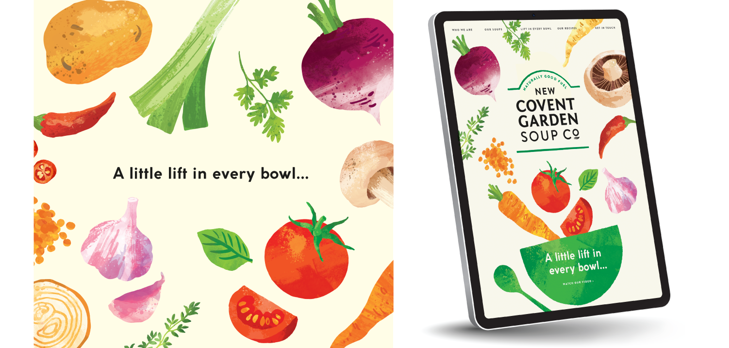
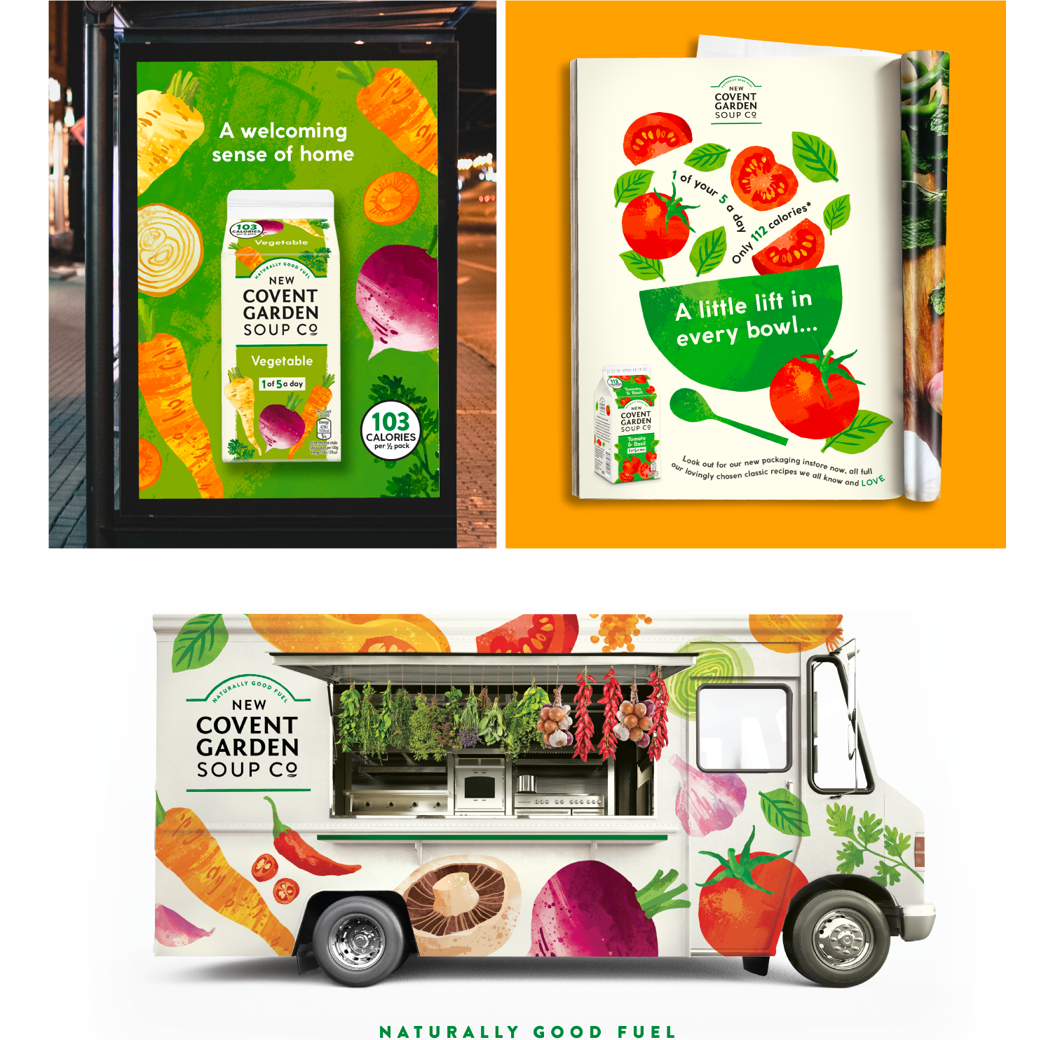
Multiple pack refreshes over the years resulted in design that was cluttered and lacking a clear message. To separate New Covent Garden from the rest, we took the brand’s identity back to its core with a modern expression infused with simplicity and joy. Stemming from the positioning line “Naturally Good Fuel”, we crafted a new design idea to hinge the brand refresh on. “A little lift in every bowl” was the perfect way to communicate the joy and goodness that a New Covent Garden Soup gives you.
Infusing fun and flavour.
We carefully enhanced the brand marque, keeping the arc but breaking it out of its box as a signal of newfound confidence. We then shone a spotlight on the soup’s fresh ingredients by commissioning well-known foodie artist, Ohn Mar Win, to create charming watercolour veggies – alongside vibrant variant colours to build taste and flavour. By keeping the edges free of colour, we leveraged the bran’s distinctive off-white tetra pack for maximum recognition in-store and online.
Lorem ipsum dolor sit amet, consectetuer adipiscing elit, sed diam nonummy nibh euismod tincidunt ut laoreet dolore magna aliquam erat volutpat. Ut wisi enim ad minim veniam, quis nostrud exerci tation ullamcorper suscipit lobortis nisl ut aliquip ex ea commodo consequat. Duis autem vel eum iriure dolor in hendrerit in vulputate velit esse molestie consequat, vel illum dolore eu feugiat nulla facilisis at vero eros et accumsan et iusto odio dignissim qui blandit praesent luptatum zzril delenit augue duis dolore te feugait nulla facilisi.
Lorem ipsum dolor sit amet, cons ectetuer adipiscing elit, sed diam nonummy nibh euismod tincidunt ut laoreet dolore magna aliquam erat volutpat. Ut wisi enim ad minim veniam.
Lorem ipsm dolor sit amet, consectetuer adipiscing elit, sed diam nonummy nibh euismod tincidunt ut laoreet dolore magna aliquam erat volutpat. Ut wisi enim ad minim veniam, quis nostrud exerci tation ullamcorper suscipit lobortis nisl ut aliquip ex ea commodo consequat. Duis autem vel eum iriure dolor in hendrerit in vulputate velit esse molestie consequat, vel illum dolore eu feugiat nulla facilisis at vero eros et accumsan et iusto odio dignissim qui blandit praesent luptatum zzril delenit augue duis dolore te feugait nulla facilisi.
Lorem ipsum dolor sit amet, cons ectetuer adipiscing elit, sed diam nonummy nibh euismod tincidunt ut laoreet dolore magna aliquam erat volutpat. Ut wisi enim ad minim veniam.
Lorem ipsum dolor sit amet, consectetuer adipiscing elit, sed diam nonummy nibh euismod tincidunt ut laoreet dolore magna aliquam erat volutpat. Ut wisi enim ad minim veniam, quis nostrud exerci tation ullamcorper suscipit lobortis nisl ut aliquip ex ea commodo consequat. Duis autem vel eum iriure dolor in hendrerit in vulputate velit esse molestie consequat, vel illum dolore eu feugiat nulla facilisis at vero eros et accumsan et iusto odio dignissim qui blandit praesent luptatum zzril delenit augue duis dolore te feugait nulla facilisi.
Lorem ipsum dolor sit amet, cons ectetuer adipiscing elit, sed diam nonummy nibh euismod tincidunt ut laoreet dolore magna aliquam erat volutpat. Ut wisi enim ad minim veniam.