BLAQ had the basics covered: great products, an innovative spirit, and a focus on sustainability. But they lacked what was needed to connect with a newer, younger generation – the Z factor. Our opportunity was to breathe new life into the brand through a Gen Z lens – creating a bold new creative platform, and packaging to match.
Zeroing in on Zoomers.
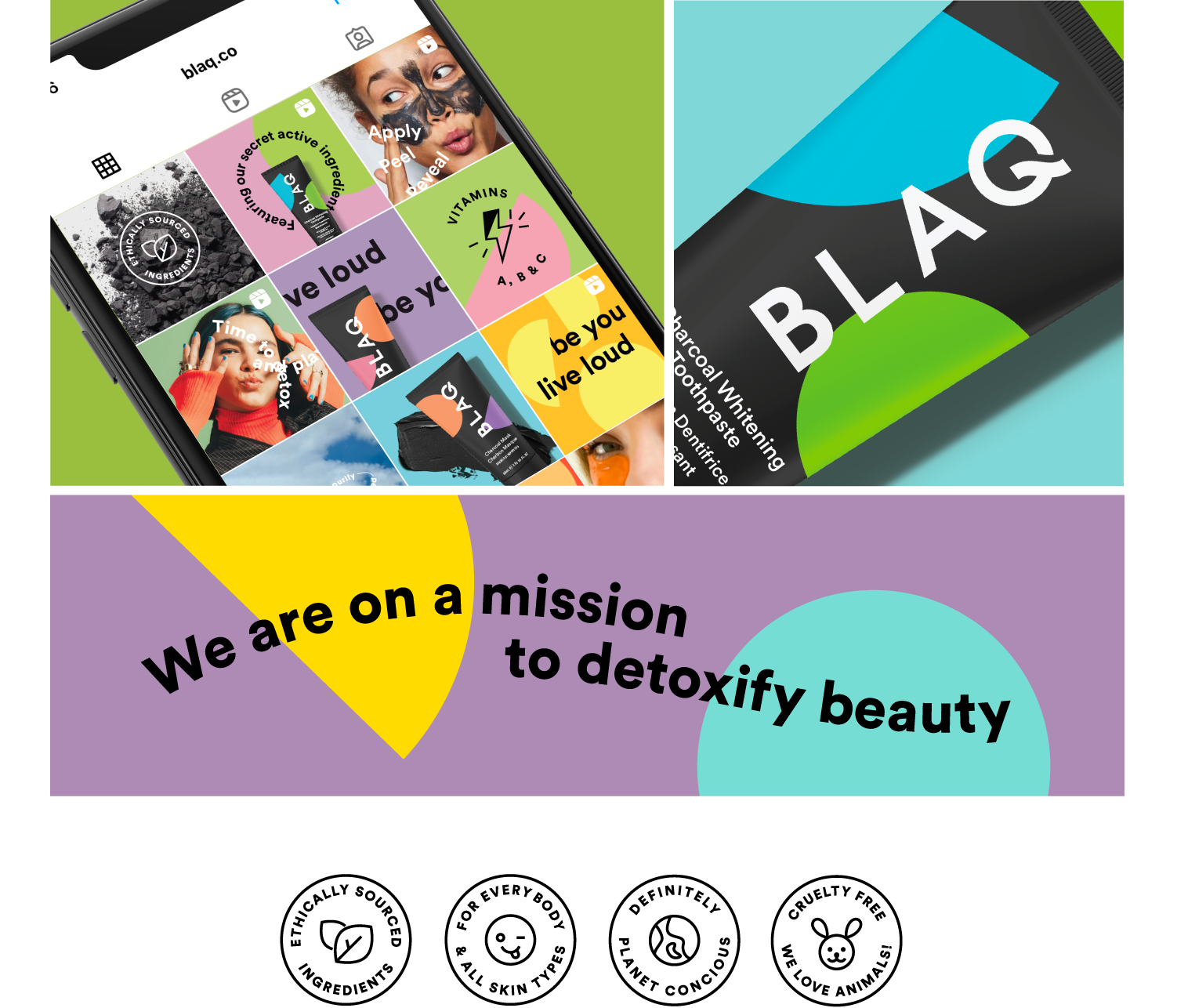
Gen Z’s view of beauty is about radical self-acceptance. They’re playful with who they are, and don’t like being confined to a box. This is a generation that believes beauty shouldn’t come at the expense of the planet. Our refreshed identity needed to reflect this with a focus on fun, purpose and diversity.
We started by defining a strong purpose: Detoxify the beauty world, creating playful, easy and efficacious regimes for all.
Into the nitty gritty.
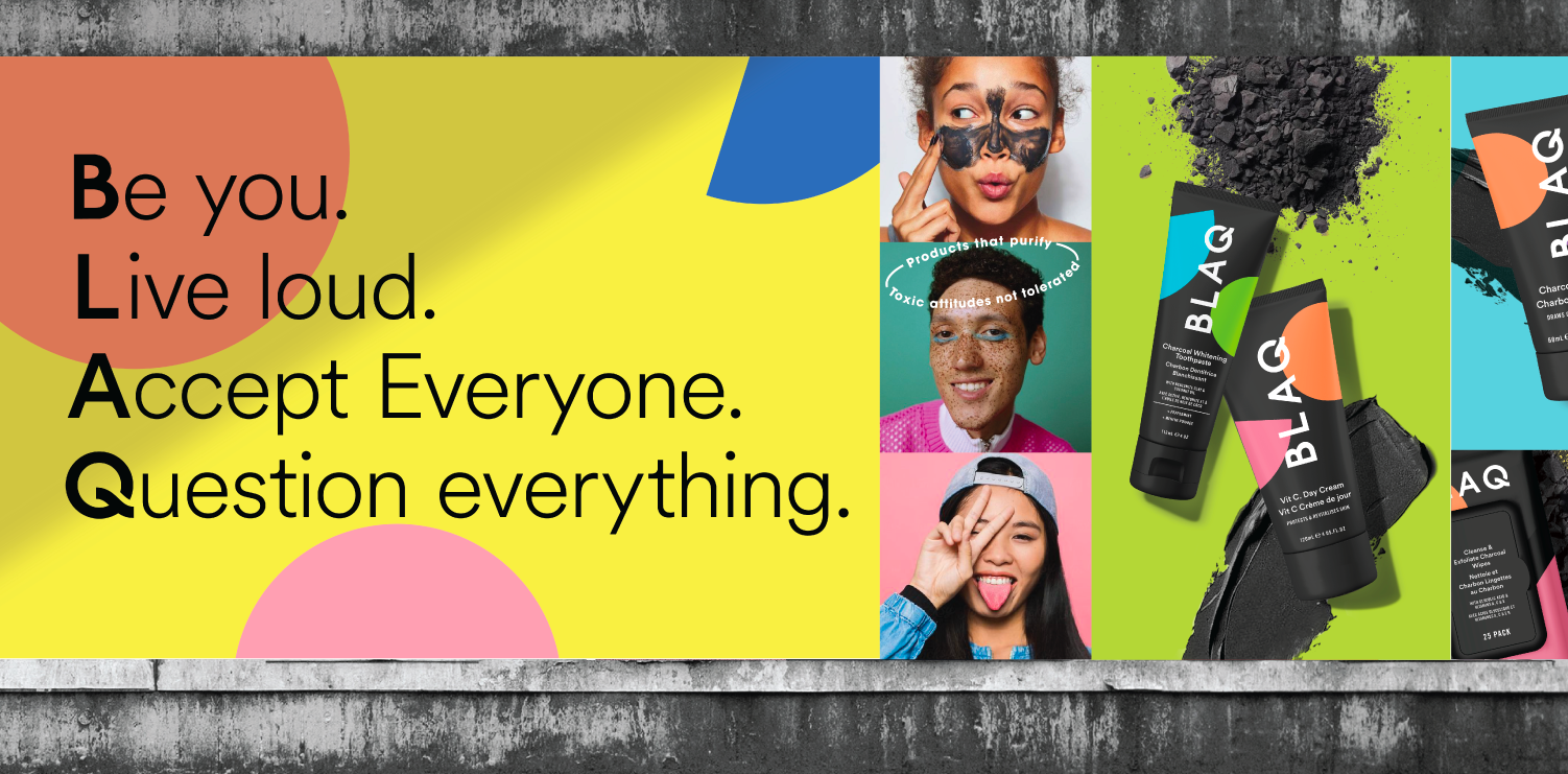
The refreshed brand is playful and unapologetic in design and attitude – while fragmented creative reflects time split between Gen Z’s two worlds: the ever-evolving digital world (URL) and the real world (IRL). We’ve created an evolved logo that’s about owning BLAQ’s unique identity, while art direction is deliberately raw, real and unpolished – expressing bucketloads of attitude and individuality.
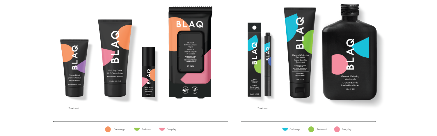
Vibrant primary colours unleash the brand’s fun side, while dynamic, meandering headline shapes embody energy. On the packaging, we’ve used geometric shapes to help with navigation and inject an even bigger dose of joy.
What we did:
Identity Refresh, Packaging Design, Web and Social Design, Art Direction, Photography
Lorem ipsum dolor sit amet, consectetuer adipiscing elit, sed diam nonummy nibh euismod tincidunt ut laoreet dolore magna aliquam erat volutpat. Ut wisi enim ad minim veniam, quis nostrud exerci tation ullamcorper suscipit lobortis nisl ut aliquip ex ea commodo consequat. Duis autem vel eum iriure dolor in hendrerit in vulputate velit esse molestie consequat, vel illum dolore eu feugiat nulla facilisis at vero eros et accumsan et iusto odio dignissim qui blandit praesent luptatum zzril delenit augue duis dolore te feugait nulla facilisi.
Lorem ipsum dolor sit amet, cons ectetuer adipiscing elit, sed diam nonummy nibh euismod tincidunt ut laoreet dolore magna aliquam erat volutpat. Ut wisi enim ad minim veniam.
Lorem ipsm dolor sit amet, consectetuer adipiscing elit, sed diam nonummy nibh euismod tincidunt ut laoreet dolore magna aliquam erat volutpat. Ut wisi enim ad minim veniam, quis nostrud exerci tation ullamcorper suscipit lobortis nisl ut aliquip ex ea commodo consequat. Duis autem vel eum iriure dolor in hendrerit in vulputate velit esse molestie consequat, vel illum dolore eu feugiat nulla facilisis at vero eros et accumsan et iusto odio dignissim qui blandit praesent luptatum zzril delenit augue duis dolore te feugait nulla facilisi.
Lorem ipsum dolor sit amet, cons ectetuer adipiscing elit, sed diam nonummy nibh euismod tincidunt ut laoreet dolore magna aliquam erat volutpat. Ut wisi enim ad minim veniam.
Lorem ipsum dolor sit amet, consectetuer adipiscing elit, sed diam nonummy nibh euismod tincidunt ut laoreet dolore magna aliquam erat volutpat. Ut wisi enim ad minim veniam, quis nostrud exerci tation ullamcorper suscipit lobortis nisl ut aliquip ex ea commodo consequat. Duis autem vel eum iriure dolor in hendrerit in vulputate velit esse molestie consequat, vel illum dolore eu feugiat nulla facilisis at vero eros et accumsan et iusto odio dignissim qui blandit praesent luptatum zzril delenit augue duis dolore te feugait nulla facilisi.
Lorem ipsum dolor sit amet, cons ectetuer adipiscing elit, sed diam nonummy nibh euismod tincidunt ut laoreet dolore magna aliquam erat volutpat. Ut wisi enim ad minim veniam.