Billson's

An amazing success driven by design & innovation

In 2017 our founder Mark Cowan came across a run-down 150 year old brewery in the historic town of Beechworth and saw the potential in combining his knowledge of what makes brands successful with the dream of owning one.

While taking inventory, a provenance story was discovered that had to be surfaced and Murray Brewery was rebranded, bring back the iconic and unique original name of Billson’s.

Reinvention from restoration

The challenge was bringing an old brand into a modern frame and into an exploding category. By preserving the traditional and timeless elements of the original brand, we were able to reignite and reinvent its future.

Absorbing the remarkable past of the brewery, the reinvented brand took shape with one foot in original recipes and tradition, and one foot in a singular vision of what makes a brand successful with consumers of today.

The brand that became a tourist destination

Bringing Billson’s Brewery into the 21st century involved so much more than creating the brand identity – from careful restoration of the buildings and equipment to creating a brewery that would become a destination.

  • Since we opened the doors in 2019, our vision of Billson’s has brought new life into the whole community:
    Top turnover business in Beechworth
  • Top employer in Beechworth
  • No. 1 visitor attraction in Beechworth
  • Tourism increased by 30% and attracting 100s of thousands of visitors to the town

Using shopper insight to create a movement

Billson’s is based on a simple, yet disruptive idea: a combination of authentic heritage and craftsmanship, that taps into a sense of modern nostalgia through flavour experiences.

Hundreds of flavours across a range of categories, from cordial to beer, spirits and RTDs paired with on-trade support and social media at breakneck pace was quickly embraced by retail and consumers everywhere.

Creating unforgettable, immersive experiences to build brand relevance

The cult favourite brand status is carefully created through immersive experiences that let consumers interact with the brand on a multi-sensory level.

In July 2023, we transformed a historic building in Melbourne’s Windsor into a sensory wonderland for two unforgettable nights of music, flavour lab tastings, a merch claw machine, unexpected food pairing, real flash tattoos and a giant, bespoke wheel of fortune.

Fortune favours the flavoursome!

Annual sales grew from $160k - $105m in 5 years

Sales tripled every year from 2019 to 2023 taking the brand to $105M in five years.

As a result, our work was recognised with the prestigious Grand Prix in the global Design Effectiveness Awards, voting Billson’s as the most effective design in the world in 2022.

In-Depth Case Study

Breathing New Life into a Regional Icon with Brand Identity

“This is a story of a comeback, of a return to quality. About a commitment to local and the revival of craftsmanship. About the truth that sometimes we don’t need to re-invent. We just need to restore.”

When Mark Cowan, after three decades of building other people’s brands, decided to create one of his own, he didn’t start with a blank sheet of paper. In 2017 he discovered a 150-year-old brewery in Beechworth — trading as Murray Breweries — that looked derelict, part cordial factory, part pigeon roost. This project focused on brand identity to restore Billson’s heritage while creating a contemporary, recognisable presence for modern shoppers.

What others saw as a relic, Mark saw as storytelling gold:

  • A heritage name waiting to be reclaimed — Billson’s, founded by George Billson in 1865
  • A pristine natural water source with a huge water licence
  • A site that carried 150 years of untapped craft and local pride

This was not simply the rescue of a crumbling brewery. It was the revival of a regional icon, showing that brand identity, recognition, and equity can be rediscovered, not just invented.

Trade media noticed. Inside FMCG described it as “one of the most ambitious heritage brand revivals in Australian beverages.” Retail World called it “a textbook case of how design thinking and a clear sense of place can reignite a sleepy category.” Even The Shout and Drinks Trade highlighted the story as evidence that authentic provenance, when coupled with sharp brand identity, can cut through in competitive liquor aisles.

Restoring Brand Identity with Professional Packaging Design

The first challenge was to re-establish the brand’s identity. Cowan and his team of seasoned designers set out to:

  • Reclaim the historic Billson’s name and original narrative of craft and place
  • Create a bold new design concept rooted in authenticity yet resonant with contemporary shoppers
  • Innovate across the product line — not just cordials, but also sodas, beers, spirits and RTDs
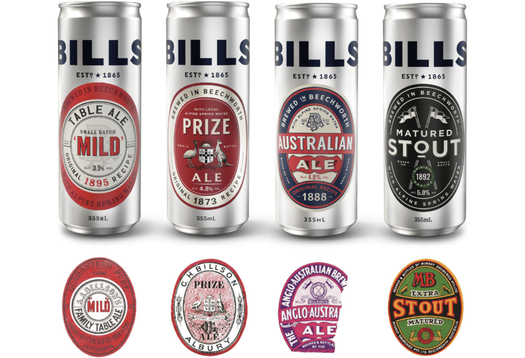
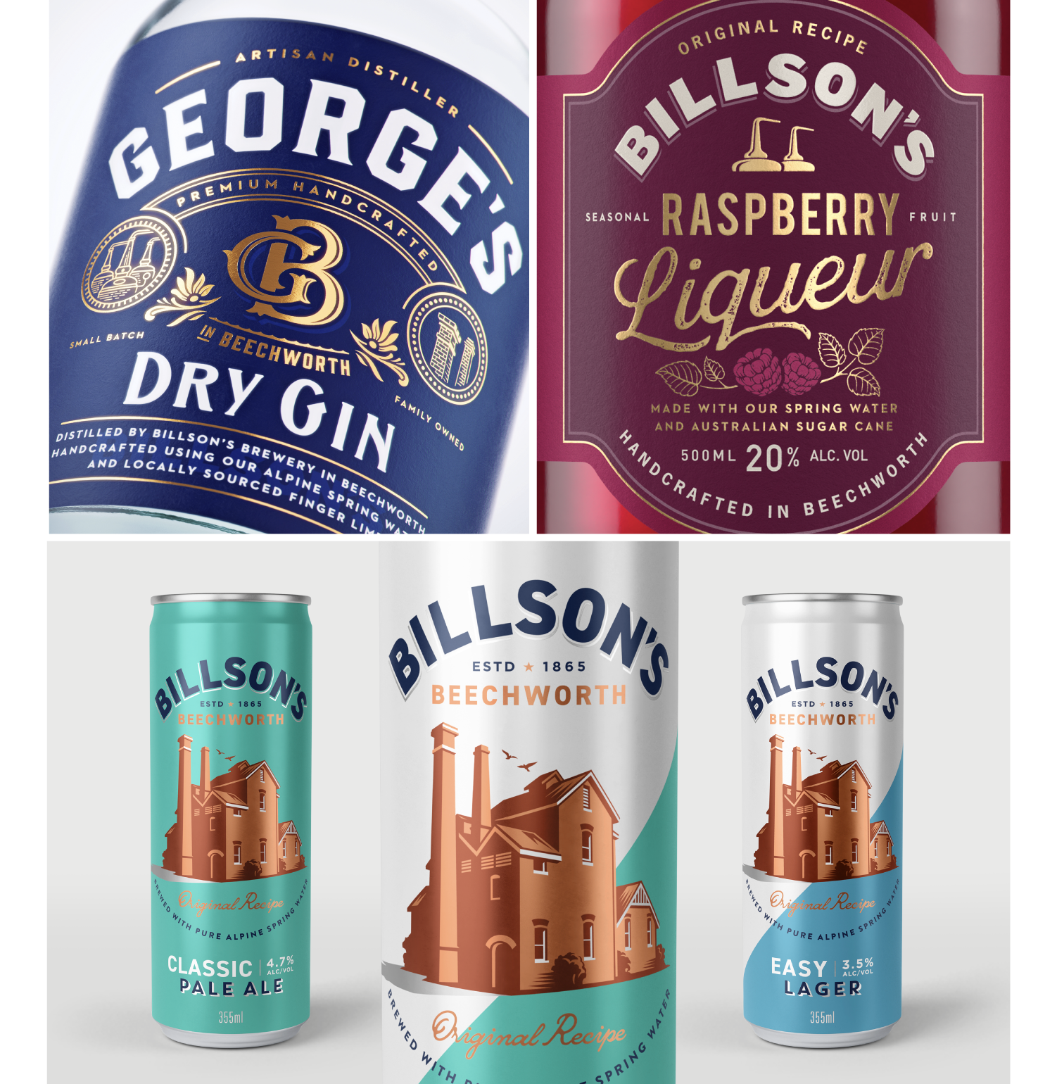
  • Deliver packaging that combined heritage cues, bold colours and modern clarity to tell the story while appealing to today’s tastes

By restoring Billson’s brand identity, the design brought heritage and modernity together in a way that resonated with consumers while clearly differentiating the products on shelf. The result was a bold, recognisable identity that could flex across multiple categories, from cordials to beers and RTDs, unifying the range without losing individuality.

The Billson’s revival demonstrates how brand identity can preserve history while creating relevance for today’s market. Through careful design and a focus on authenticity, Billson’s is positioned not just as a restored heritage brand, but as a vibrant, contemporary choice for Australian consumers who value craft, quality, and local provenance.

The result was that brand equity could be anchored in both heritage credibility and modern relevance — two of the most powerful drivers of long-term preference. As B&T magazine put it at the time, “Billson’s shows that you don’t always have to be new to be newsworthy — if you rediscover your roots with craft and style.”

Cordial Relations — Premiumising a Nostalgic Category

Mark recalls the first decisive step: “Eventually, the siren call of doing it myself became too loud. Having flirted with a few ‘deceased estates’ of brands, I stumbled across a dusty little cordial business perched in the foothills of the Victorian Alps. It had history, a semi-dilapidated homestead, and just enough romance to cloud my better judgement.”

Cordial had been commoditised for decades. That meant the only viable path was to pitch premium.

Billson’s leveraged both nostalgia and quality cues:

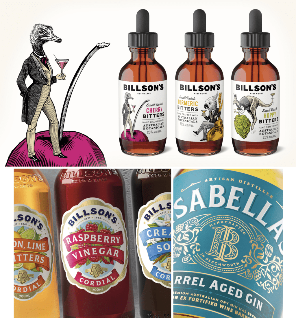
  • Design priorities first: a consistent packaging style and visual language that re-established cordial as a crafted product rather than a cheap commodity
  • Heritage-inflected bottles: glass, embossed, with classic typography that stood out in a PET-dominated aisle
  • Positioning: tapped into Australians’ affection for “the good stuff” they remembered from childhood, now re-imagined for adults and younger premium seekers

Trade publications like Inside FMCG praised the move for “making cordial feel special again,” while Retail World highlighted that premiumisation of a sleepy grocery sub-category was “led by pack, not by price.”

Retailer reaction was mixed — one major chain ranged it enthusiastically, another refused at first, citing price. But shopper insight and early sales vindicated the approach.

Shopper Insights in the Cordial Category

Nostalgia + Quality Premium
By reviving a heritage brand and highlighting local sourcing, Billson’s tapped into personal connection and willingness to pay a premium for great packaging and good design.

Shelf Stand-Out in a Commodity Aisle
In aisles dominated by cheap PET bottles, the glass bottle, classic typography and embossed details signalled authenticity and higher perceived quality.

Shopper Insights in the Cordial Category

Nostalgia + Quality Premium
By reviving a heritage brand and highlighting local sourcing, Billson’s tapped into personal connection and willingness to pay a premium for great packaging and good design.

Shelf Stand-Out in a Commodity Aisle
In aisles dominated by cheap PET bottles, the glass bottle, classic typography and embossed details signalled authenticity and higher perceived quality.

Cordial Stretched Thin — Cracking the RTD Code

Success breeds ambition.
Having restored cordial, the team set their sights on RTD alcohol — “the tricky corner” of liquor retail.

“I felt that’s where our credentials and our ambitions really belonged. And so, our first line of RTD cans was born, dripping with attitude and just a hint of mischief.”

For a brand-builder, RTDs were attractive precisely because brand identity often outweighs the product itself. The team understood that in RTDs, visual assets drive impulse at shelf. Billson’s RTDs adopted a bolder packaging style, a playful tone of voice, and distinctive colours to grab attention.
Campaigns spanned in-store activations, social content, and influencer partnerships.

Trade titles such as The Shout described the launch as “the shot in the arm RTDs needed,” while Drinks Trade credited the design-driven approach with “helping the heritage brand feel surprisingly fresh in a crowded chiller.”

Shopper Insights in the RTD Alcohol Category

Seconds to Impact
Shoppers often decide in under five seconds.

Occasion-Driven Imagery
Design had to evoke BBQs, picnics, summer festivals.

Legitimacy via Heritage
Even with a rebellious tone, heritage credentials reassured shoppers.

Trial Through Distinctive Assets
Consistent dieline, hierarchy and seals built memory structures.

Spirit of the Matter — Coming Full Circle

“Our star was rising on our new family of products and there came a moment when we wanted to return to the heritage roots of the brewery… Spirits are the ultimate holy grail for marketers — often the taste is overshadowed by the power and appeal of the brand.”

Premium spirits demanded a more refined packaging design:

  • Distinctive glass structures and embossing conveyed craft
  • Heritage storytelling on-pack reinforced provenance and trust
  • Consistency across brand experiences at the dillery, retail shelves and e-commerce tied the journey together

Packaging Design as the Bridge Between Brand Identity and Shopper Choice

Across all phases, packaging was the bridge:

  • Translating brand story into instantly recognisable visual elements
  • Meeting regulatory needs while retaining strong design personality
  • Helping shoppers — from nostalgic adults to younger explorers — find the information and emotional cues they valued
  • Turning the physical pack into the main media channel for awareness, recognition and loyalty

Lessons for Marketers and Designers

As Inside FMCG summed up in a 2023 feature:
“Billson’s has proven that the right brand assets on the right pack can revive a forgotten name and reposition an entire category.”

Heritage Is an Asset — If You Unlock It
Forgotten brands can be revitalised when their stories are expressed with strong creative design.

Design Priorities Are Real
Name, story and visual identity come first; then let the brief guide the design process.

Shopper Insight Is Non-Negotiable
In categories where the product is similar, it’s the human connection and unboxing experience that drives choice.

Packaging Builds Memory Structures
Distinctive assets become shortcuts for recognition and loyalty.

Brand Equity Is Built in Phases
Start with credibility (cordial), expand to adjacent ranges (RTDs), then elevate to aspirational (spirits).

The Bigger Picture
Restoring, Not Reinventing

Billson’s showcased that sometimes the strongest brand identity and equity lie dormant in forgotten names and overlooked categories. By blending heritage with contemporary design and insight, the team built not just good packaging but a compelling growth engine.

Trade media from Inside FMCG to The Shout repeatedly framed the story as “the blueprint for heritage-led innovation.” It has since become a case study for marketers and packaging designers on how to revive an old name for a new era.

What we did:
Aquisition, Naming & Brand Identity, Innovation, Packaging Design, Production & Final Art, Key Visuals, Brand Experience, POS & Trade

Explore more of our work

Let’s talk about your brand. Contact us

We go beyond the brief to solve brand and business problems with shopper insight and strategic creativity.

team

Wilfred Castillo

Associate CD

SEA

Lorem ipsum dolor sit amet, consectetuer adipiscing elit, sed diam nonummy nibh euismod tincidunt ut laoreet dolore magna aliquam erat volutpat. Ut wisi enim ad minim veniam, quis nostrud exerci tation ullamcorper suscipit lobortis nisl ut aliquip ex ea commodo consequat. Duis autem vel eum iriure dolor in hendrerit in vulputate velit esse molestie consequat, vel illum dolore eu feugiat nulla facilisis at vero eros et accumsan et iusto odio dignissim qui blandit praesent luptatum zzril delenit augue duis dolore te feugait nulla facilisi.

Lorem ipsum dolor sit amet, cons ectetuer adipiscing elit, sed diam nonummy nibh euismod tincidunt ut laoreet dolore magna aliquam erat volutpat. Ut wisi enim ad minim veniam.

Does your brand identity & packaging design connect with shoppers? Want to have a chat about it?

team

Adam Cameron

Global CFO

Text

Lorem ipsm dolor sit amet, consectetuer adipiscing elit, sed diam nonummy nibh euismod tincidunt ut laoreet dolore magna aliquam erat volutpat. Ut wisi enim ad minim veniam, quis nostrud exerci tation ullamcorper suscipit lobortis nisl ut aliquip ex ea commodo consequat. Duis autem vel eum iriure dolor in hendrerit in vulputate velit esse molestie consequat, vel illum dolore eu feugiat nulla facilisis at vero eros et accumsan et iusto odio dignissim qui blandit praesent luptatum zzril delenit augue duis dolore te feugait nulla facilisi.

Lorem ipsum dolor sit amet, cons ectetuer adipiscing elit, sed diam nonummy nibh euismod tincidunt ut laoreet dolore magna aliquam erat volutpat. Ut wisi enim ad minim veniam.

team

Sharon Lee

Managing Director

APAC

Lorem ipsum dolor sit amet, consectetuer adipiscing elit, sed diam nonummy nibh euismod tincidunt ut laoreet dolore magna aliquam erat volutpat. Ut wisi enim ad minim veniam, quis nostrud exerci tation ullamcorper suscipit lobortis nisl ut aliquip ex ea commodo consequat. Duis autem vel eum iriure dolor in hendrerit in vulputate velit esse molestie consequat, vel illum dolore eu feugiat nulla facilisis at vero eros et accumsan et iusto odio dignissim qui blandit praesent luptatum zzril delenit augue duis dolore te feugait nulla facilisi.

Lorem ipsum dolor sit amet, cons ectetuer adipiscing elit, sed diam nonummy nibh euismod tincidunt ut laoreet dolore magna aliquam erat volutpat. Ut wisi enim ad minim veniam.

Add Your Heading Text Here

Lorem ipsum dolor sit amet, consectetur adipiscing elit. Ut elit tellus, luctus nec ullamcorper mattis, pulvinar dapibus leo.