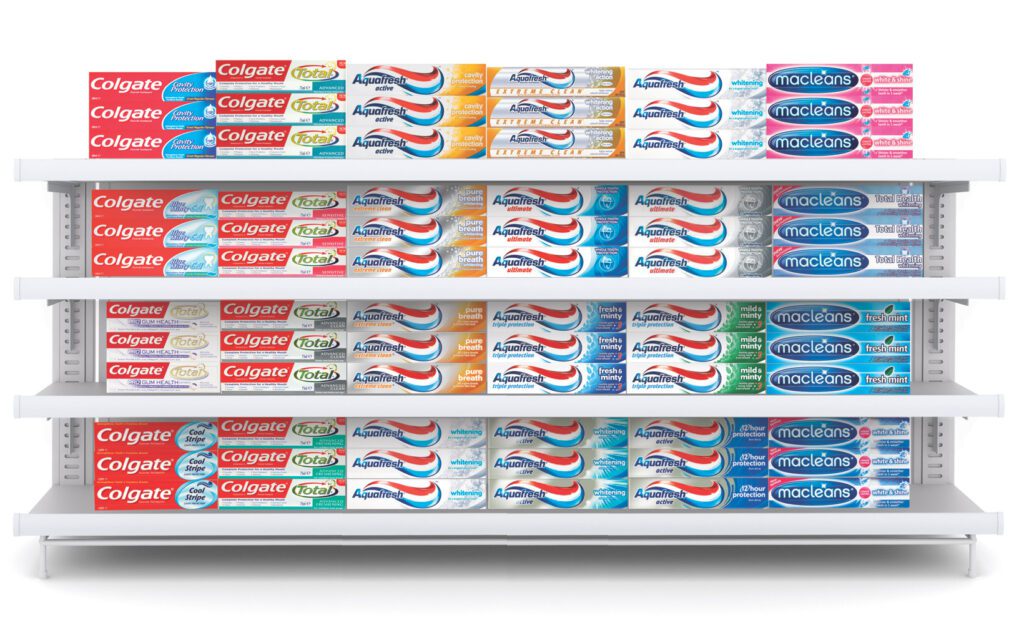
Oral care brands tend to fall into familiar patterns – relying on bright, shiny smiles, science-based messaging and uninspiring, indistinguishable packaging. Aquafresh, despite being one of the world’s leading oral care brands, was getting lost in this sea of sameness. Its colour palette was muted and its branding wasn’t working hard enough to distinguish it from the multitude of other options.
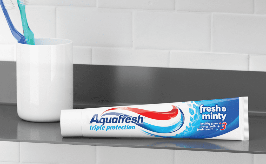
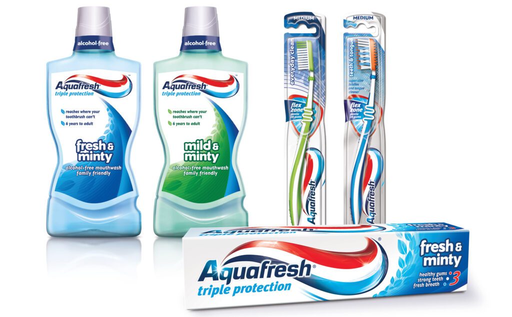
Aquafresh’s most distinctive asset was its 3-stripe formula. However, this defining feature lacked prominence on the packaging, diminishing its impact.
Six seconds quicker to find.
Cowan’s objective was to create a new packaging design that would be impossible to miss on the shelf. Harnessing the iconic 3-stripe nurdle, we transformed an unnoticed, under-utilised graphic into a striking and memorable brand icon. The new identity perfectly captures the brand’s confident and approachable personality, significantly increasing its visibility on store shelves – and making it six seconds quicker to find.
A breath of fresh air.
While other brands remained locked in category conventions, competing on science, we created a brand that demands immediate attention. Indisputable, unmistakably Aquafresh.
Lorem ipsum dolor sit amet, consectetuer adipiscing elit, sed diam nonummy nibh euismod tincidunt ut laoreet dolore magna aliquam erat volutpat. Ut wisi enim ad minim veniam, quis nostrud exerci tation ullamcorper suscipit lobortis nisl ut aliquip ex ea commodo consequat. Duis autem vel eum iriure dolor in hendrerit in vulputate velit esse molestie consequat, vel illum dolore eu feugiat nulla facilisis at vero eros et accumsan et iusto odio dignissim qui blandit praesent luptatum zzril delenit augue duis dolore te feugait nulla facilisi.
Lorem ipsum dolor sit amet, cons ectetuer adipiscing elit, sed diam nonummy nibh euismod tincidunt ut laoreet dolore magna aliquam erat volutpat. Ut wisi enim ad minim veniam.
Lorem ipsm dolor sit amet, consectetuer adipiscing elit, sed diam nonummy nibh euismod tincidunt ut laoreet dolore magna aliquam erat volutpat. Ut wisi enim ad minim veniam, quis nostrud exerci tation ullamcorper suscipit lobortis nisl ut aliquip ex ea commodo consequat. Duis autem vel eum iriure dolor in hendrerit in vulputate velit esse molestie consequat, vel illum dolore eu feugiat nulla facilisis at vero eros et accumsan et iusto odio dignissim qui blandit praesent luptatum zzril delenit augue duis dolore te feugait nulla facilisi.
Lorem ipsum dolor sit amet, cons ectetuer adipiscing elit, sed diam nonummy nibh euismod tincidunt ut laoreet dolore magna aliquam erat volutpat. Ut wisi enim ad minim veniam.
Lorem ipsum dolor sit amet, consectetuer adipiscing elit, sed diam nonummy nibh euismod tincidunt ut laoreet dolore magna aliquam erat volutpat. Ut wisi enim ad minim veniam, quis nostrud exerci tation ullamcorper suscipit lobortis nisl ut aliquip ex ea commodo consequat. Duis autem vel eum iriure dolor in hendrerit in vulputate velit esse molestie consequat, vel illum dolore eu feugiat nulla facilisis at vero eros et accumsan et iusto odio dignissim qui blandit praesent luptatum zzril delenit augue duis dolore te feugait nulla facilisi.
Lorem ipsum dolor sit amet, cons ectetuer adipiscing elit, sed diam nonummy nibh euismod tincidunt ut laoreet dolore magna aliquam erat volutpat. Ut wisi enim ad minim veniam.